One of the components in my independent project for Mishka Social Services (MSS) involved redesigning the their logo (which can be seen below). This was a crucial initial step to the re-branding of the organization. The logo that was being used for about 3.5 years was created by the founder of the organization (a social worker) so it needed to be refined for it to look professional, because we wanted to position ourselves as an organization that was dedicated to creating quality social service programs and filling in any gaps in the Hamilton community.
Step 1: Communication
The first step to executing this redesign was communicating with the MSS board members about what they wanted from the logo (those experiences are outlined in a previous blog post). Long story short, I got the sense that they didn’t want to drift too far off form the current logo concept.
Step 2: Ideation
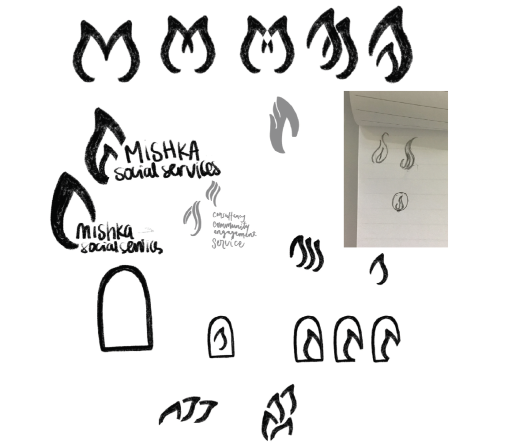
Next I went to the drawing board (i.e. my iPad). There I tried to come up with alternative ideas that were a play on the flame symbol that was in the logo. I keep up with a few sketches and ideas (that can be seen below) and showed them to some of the board members as initial concepts. They seemed interested in one of the directions so I decided to carry that forward and roll it out in some digital comps.

Step 3: Digitization
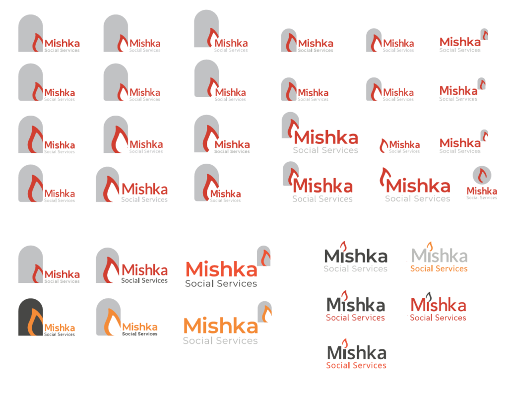
I took my sketches to illustrator and started exploring the direction they selected above in a digital composition. I made several variations in size, and typeface and explored some new ideas with the flame as they developed. I this point I was also exploring colours. I took the rebrand as a opportunity to introduce a potentially brighter brand for MSS.

Step 4: The Problem
In all my composition to this point I was using the flame symbol of the logo in different ways. Then came the cold realization that apparently the person who created the logo (I mentioned previously that she is a social worker, i.e. she did not have design experience) found a flame icon they liked on Google (maybe tweaked it a little) and used it in the logo. And I as self respecting graphic designer couldn’t just let that go. So I embarked on my journey to create a new flame that can be used as the MSS symbol. This proved to be a lot harder than I expected and took several hours to accomplish. I went went between working in Illustrator and doing sketches about 3 times on 3 different days before I finally landed on something good.

Step 5: Selection
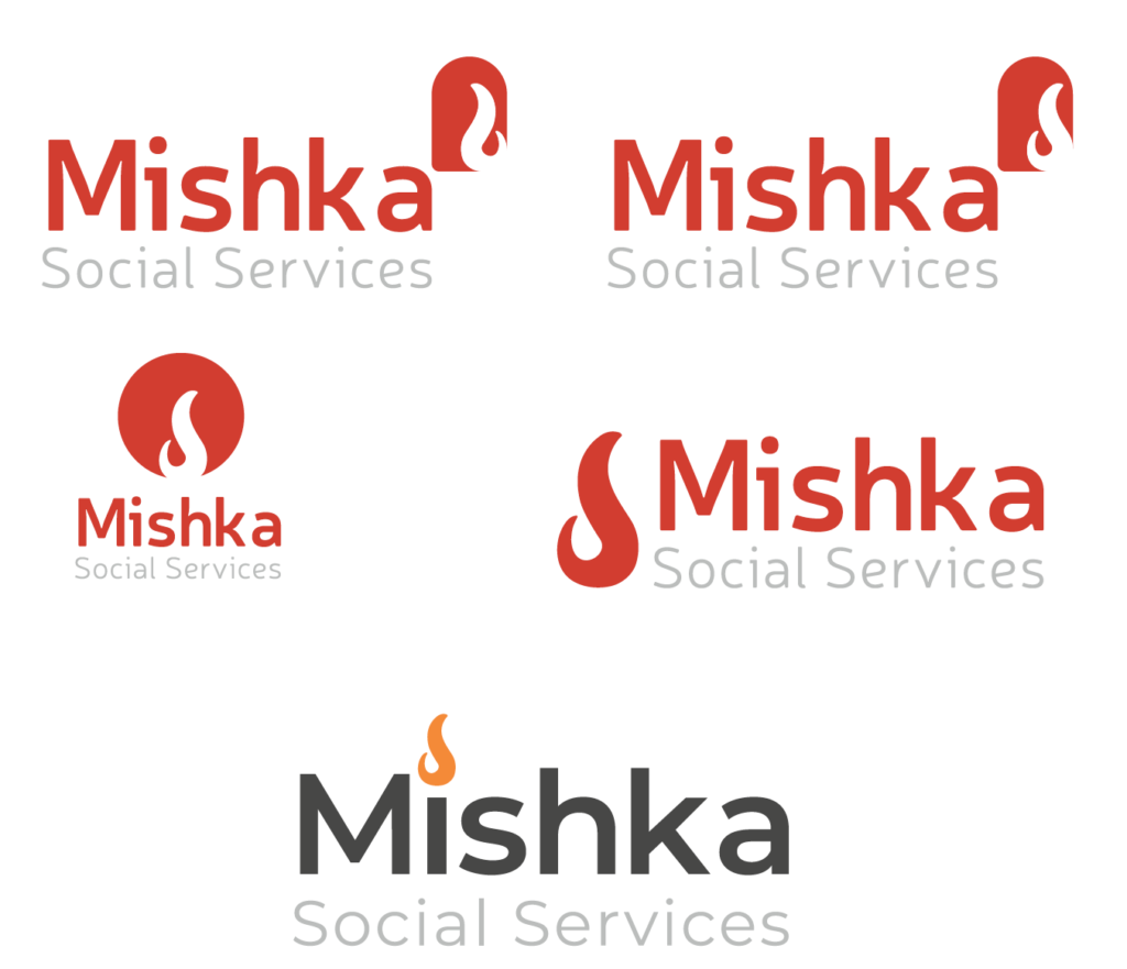
After coming up with flame and narrowing down my type and logo concepts it was time to have the board members select their favourite. This was a 3 part process and the first two parts were achieved via an anonymous vote because the decision needed to be made sooner rather than later and there was no time to meet. The first online vote allowed them to choose between 3 typeface, 3 on-colour black logo variations, and 3 colours palettes. The colour selection ended up being 50/50 between two colour palettes. So in the second form they had to choose the full colour set layout they wanted to see. After that the groups was split 50/50 between to colours variations so there was a WhatsApp conversation to help narrow it down until we it was finally decided on. And now the logo is as can be seen below.
This experience has been an interesting one and one that I’ve learned a lot from. I think one of the things I would change is to have a more formal client briefing process and it would probably be easier to make the final decision in person at a meeting (I think).
