Typography Poster
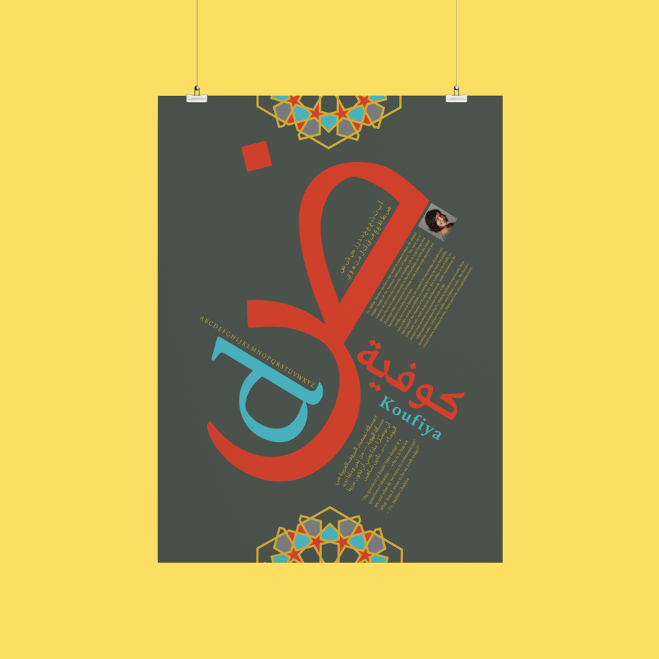
To complete this project we were encouraged to select a typeface that reflects our heritage and create a poster highlighting the type. I choose an Arabic typeface called Koufiya that was created by type designer, Nadine Chahine. She created both the Arabic and Latin characters simultaneously in an effort to create a typeface where the two languages work in harmony.
In creating this design the biggest challenge was alignment because Arabic is written right to left whereas English is written left to right. I was only able to overcome this when I understood first that this was an opportunity to highlight an Arabic character as the focal point of the poster rather than English.
This project reconnected me to my lingual roots and was the assignment that re-taught me the value of the Arabic language and helped me appreciate the beauty of its rhythmic strokes.

