Benghazi Wayfinding System
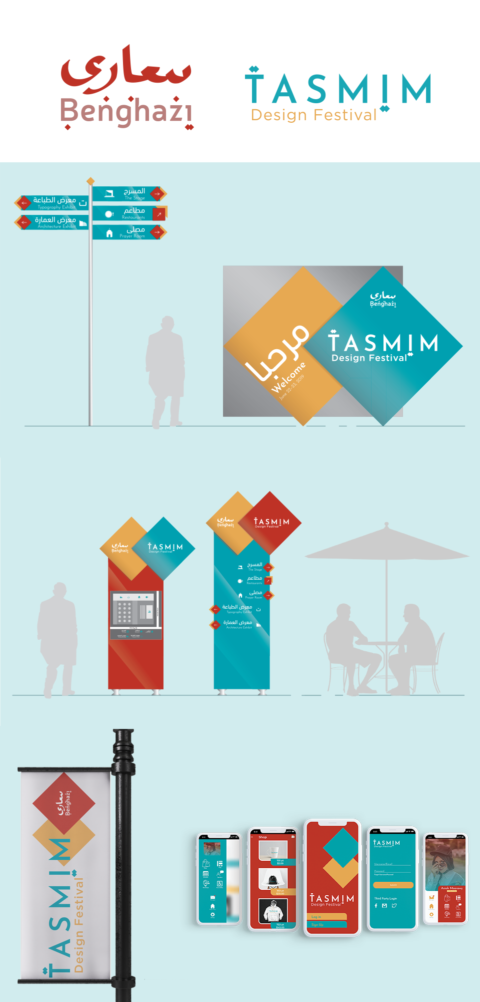
In this project we were asked to select a city for which we would create an identity and then conceive of a potential design festival in that city that we would also create the brand identity for along with a wayfinding system and an app. I decided to choose Benghazi, Libya, the city where I was born. While I had the option of choosing any city in the world, I opted for my place of birth because I took it as an opportunity to reconnect with my heritage.
The new city logo is bi-lingual, with the word Benghazi written in both Arabic and English. I wanted the identity to be reminiscent of what was considered the golden age of Benghazi by it’s citizens – the time before Gaddafi. To give it that “back-in-the-day” effect I turned to how Arabic was written thousands of years ago. In ancient times Arabic letters were written with no dots on the letters, so I took the dots and paired them with the same sounding letters in the English form of Benghazi. This also created a clear connection between the two words.
The design festival logo is meant to have a clean and professional, well typeset look that also carries the diamond elements from the city logo, since the festival is organized by the city. Arabic is the primary language spoken in Benghazi so I developed a bi-lingual wayfinding system with both Arabic and English. Lastly, I was conscious of the colours I choose because I wanted the yellow and red to reflect the terrain of sand and red clay and the blue to reflect the Mediterranean Sea since Benghazi is a port city.

